Showing posts with label art journal. Show all posts
Saturday, January 31, 2015
Life Book 2015 Creating A Dream Catcher
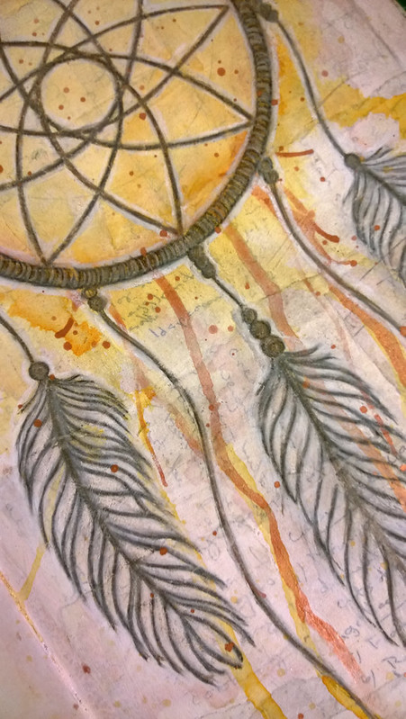
Rachel Rice was our fabulous instructor this week and she guided us through making a dream catcher using a vintage crochet doily and paper feathers on top of a collaged background.
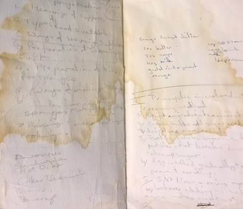
For my background I used a scan of an old text book my Mother used in the sixties when she was in highschool. It is old and stained and contains handwritten notes inside the covers. Throughout the lesson Rachel talked about how using the vintage doily connected her to the women that have come before us, and I felt using my Mother's old text book pages did the same thing.
I wanted to avoid the bulk in my journal so I used ink and pencil on top of the collage to create the dreamcatcher. I'm not sure it ended up being what I envisioned at the start, but I am happy to call this one done!
Wednesday, January 14, 2015
Life Book 2015 The Artful Wordsmith
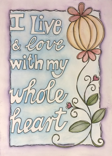
Our tutor this week is the fabulous Joanne Sharpe! I have always disliked the look of my own handwriting in journals, so I was thrilled to learn some new techniques that turn my own handwriting into letting.
This piece was done in my Dylusions journal using a black Posca pen to outline and distress markers to colour. I think the next time I do a piece like this I will use a more vibrant medium than the distress markers, but overall I am ok with how this turned out.
The quote "I live and love with my whole heart" is by Brene Brown, who is apparently my muse this year!
You can see the little speckles where the gesso didn't give 100% coverage, but I think I am ok with that!
Saturday, January 10, 2015
Life Book 2015 - Playing Tag
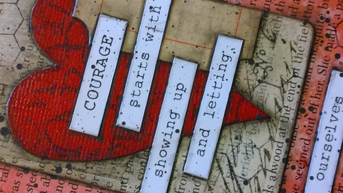
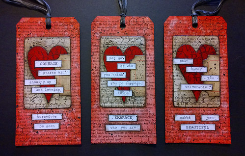
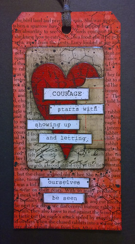
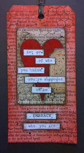
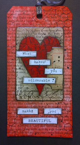
Continuing with Week 2 of Life Book 2015 with guest artist Roben-Marie Smith. The focus of her lesson was to create a quick tag using pre-printed art. I had four altered playing cards lying around doing nothing so I decided to use those on my tag.
Each of the quotes is by Brene Brown and are words of comfort and courage to me. Her books on wholehearted living and letting go of perfectionism are guiding beacons.
The tags were cut using a Tim Holtz die, and then covered in book paper. I used Red Brick Distress Ink to colour each tag and splattered water to create the texture.
The altered playing cards and words were attached with gel medium, and then splattered with black acrylic paint.
I chose the tag that had the message I most needed to hear and incorporated that into my Life Book layout.
Monday, January 5, 2015
Life Book 2015 - Beacon Of Light
It is my favourite time of the year! Life Book 2015 has just begun and I still have eight weeks before semester starts so I get to relax and enjoy creating. This is my third year joining Tamara Laporte for her year long art journalling course. It is by far the best value art course available, 52 lessons throughout the year at less than $3.00 a week.
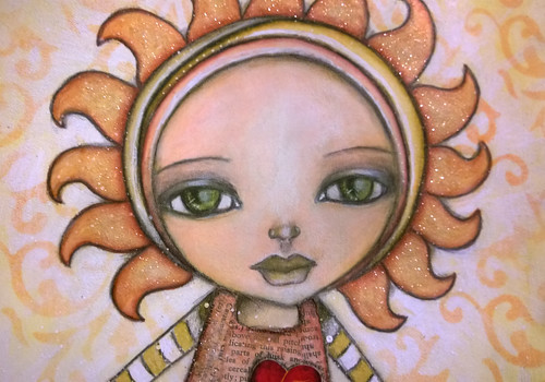
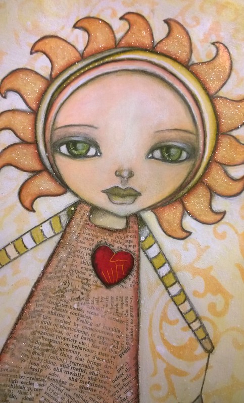
The first lesson from LB2015 is to create a 'beacon of light', an artistic/spiritual guide for the year. I used dictionary paper to create the dress on my girl and my intention for the year is to let go of the need to be perfect. This is embodied by the heart on the dress which is featured on the cover of the Brene Brown book "The Gifts Of Imperfection".
After creating the pencil sketch the page was primed with clear gesso and then painted using a combination of Neocolor II watercolour crayons, acrylic paints and Tim Holtz Distress Inks and Markers. A little sprinkle of pixie dust (aka glitter) and she really came to life!
Monday, February 10, 2014
Life Book 2014 - Spray Ink Love
Six weeks of 2014 have already flown by! I remember thinking how awesome it was that I had 6 whole weeks to do nothing but paint and play and now I have two more weeks and I am back to school!
This week's lesson was with Tamara LaPorte where she showed us how to do a side profile potrait and taught us some new techniques with ink sprays. My ink play didn't turn out how I wanted it to, but I am happy with the effect that I got.
I loved the portrait style. I was surprised at how quickly I was able to put my brush down and feel like she was finished. Although Tamara spent a lot more time to achieve a stronger sense of shadow and highlights, I was content with the very minimal, soft effect that I created after very few brush strokes. I also love how the speckles of the ink spray have come through to look like freckles!
In her hair is a celebration of our positive qualities. Still not thrilled about my handwriting but happier with this attempt at lettering than the last page.
Sunday, February 2, 2014
Life Book 2014 - Sugar Sugar
Week 5 of Life Book 2014 is with Marieke Blokland. Her theme was all things sweet! Candy, chocolate, cakes and lollipops with the thought being that these represent the sweet things in your life.
I went in a slightly different direction and used my page to highlight the struggle between making the right dietary choices, and the promise that one day the right choice will also be the easy choice. I wish I liked my handwriting more!
Monday, December 30, 2013
Life Book 2013 - Heart Sight
Week 32 of Life Book 2013 is with Effy Wild who taught us some fabulous layering and texturing techniques. This was a fabulously fast and fun page to create but very striking with a powerful message.
Wednesday, April 17, 2013
Life Book 2013 - Painting Over a Printed Image
Week 9 of Life Book 2013 is with Danita, and she taught us a simple technique for painting over a printed image, such as an image out of a magazine. I chose an image of Drew Barrymore and was quite pleased when hubby immediately recognized her! I love this technique. When you look at the painting you can't tell there is an image undernearth, which makes this a fantastic way to incorporate faces and people into art journals without feeling self conscious about your skill level.
Life Book 2013 - Unstumpification
Greetings again! Week 8 of Life Book 2013 is done with the marvelously talented Jane Davenport. This is the most challenging lesson I have done to date, both emotionally and technically. 'Stumpification' occurs when you trace around a photo of person, typically the tracing results in a 'stumpy' version of that person. By using the technique demonstrated we are taught how to 'unstumpify' the tracing. The example Jane did took an ordinary photo and she created a very lithe and sexy fashion model, which is of little surprise as Jane has a background in the fashion industry. The technique of 'unstumpification' is essentially using tracing and illustration to do on paper what magazines do in photoshop to make a woman 'more attractive'.
I choked. With the average woman being a size 12, and with so many women on constant diets, so many women with eating disorders, so many women who hate their bodies and struggle with poor self esteem, I could not bring myself to be a part of that and call it art. I know it's seemingly a small thing but we all have our lines I suppose and this one crossed mine. Further, this lesson was about bravery, and I just couldn't reconcile what seemed to be two completely polar opposite ideals.
I did try the unstumpification technique using photographs of plus size models, but it was still elongating them, smoothing out their curves, essentially making them thinner. In the end I used a plus size croquis, which is a line drawing used in the fashion illustration as a base for drawing clothing onto the human form. The only unstumping I did was to create a slightly longer neckline to allow for the additional of all that hair.
I created the comic book cover in Publisher, printed it out on heavy weight paper and then transferred the croquis using wax transfer paper. I decided to keep it monochrome and used a single shade of brown to keep with a sepia style look. It took two frustrating weeks to create the final version and by the end I was so annoyed with my efforts that I gave up on doing hands and faces, so my comic book heroine is wearing a mask! I am so glad this one is done.
Sunday, March 24, 2013
Life Book 2013 - New Blooms
This week's lesson is New Blooms taught by the fabulous Christy Tomlinson. The message of this lesson is to learn from flowers, to take what we have learned in the past (the good and the bad) and to use that to grow anew.
Last year someone told me a secret that was so painful and profane that it left me changed forever. There's a scar on my soul that will never disappear and it's not something I can ever divulge, not even in my art diary.
So how do I express that? The torn paper represents how I felt utterly ripped in two, and the splatters are there for the tears that felt like they would never end. I visualized all that pain and heartache, all that negativity and 'crap' as compost, fertile ground in which to plant a new seed, from which has emerged a new way of looking at the world. One that is less black and white, less judgmental. One that is perfectly captured with the words of Rumi:-
Out beyond ideas
of wrong doing,
and right doing,
there is a field.
of wrong doing,
and right doing,
there is a field.
I will meet you there.
Christie taught us a fabulous technique for making flowers from tin foil. I didn't want the silver of the tin foil showing through, so I covered the foil with gold leaf before applying patterned rice paper and shredded gold cellophane. I then used my Tattered Floral die to cut out the flowers. Because the base is tin foil they are completely mouldable adding outstanding dimension.
The patterned papers in the background are by Kaisercraft and I have used Distress Inks to add texture. This is also my first attempt at hand lettering!
Linking up with:
Simon Says Stamp: Quotable
Make It Monday: Anything Goes
Through The Craft Room Door: Anything Goes
Creative Every Day: Weekly Link
Friday, March 22, 2013
Life Book 2013 - True Intentions
The second lesson in Life Book 2013 is a bonus lesson with Monica Zuniga. Her inspiration to us is to make a paper doll out of (rubber) stamps. She says "Find a figure that represents yourself and then those words that represent what you will be working on throughout the year."
For this page I wanted to express my training and journey as a counsellor. The core principles of person centred counselling are empathy, congruence and unconditional positive regard, and these are the words I have chosen to use in my piece.
I chose a digital stamp by A Day For Daisies called Birds Nest, picking up on imagery of birds as both messengers and a symbol of freedom. As a counsellor I will be in a position to listen to the deepest, most painful, most shameful secrets that burden a soul, and through empathy and unconditional positive regard (non judgment) I can help that soul to find peace and freedom from their pain.
The inner area is done with a rubber stamp by Kaisercraft, from the 13th Hour collection, branches with ravens. Ravens are a sign of alertness and
watchfulness, and Dr. Carl Jung deemed raven symbolism to represent the shadow self, or the dark side of the psyche. The raven is a messenger too, so it symbolises keeping and communicating deep mysteries.
The raven is representing my own inner struggle. One of the core beliefs of counselling is that we cannot take a client to places we have not been. In other words, if I don't explore myself, challenge my own flawed thinking and beliefs (I'm ugly, I'm useless, I'm worthless etc)... If I can't turn the spotlight inward on myself, how can I help others to do the same?
An interesting note that I realized after doing this, is that I have on my back a rather large tattoo that incorporates several ravens. I had the tattoo done years ago so I often forget it's there!
The background is done with Neocolour II watercolour crayons, washed and then spritzed with a water spray and enhanced with Distress Inks. I started in the centre quite light and deepened the colour towards the edges so that I could see that there, in all that inner turmoil, radiates a light, my light.
When I first watched this lesson I was a bit 'meh' about the project, but somewhere along the way it became an incredibly deep and personal expression. Thank you Monica :o)
Thursday, March 21, 2013
Life Book 2013 - Celebration & Journey
This is the first lesson for the Life Book 2013 project. It started in January, and I am only just joining, and with a lesson per week I have some catching up to do. The purpose of this project is to celebrate the journey ahead of us while at the same time doing some mild goal setting.
The teacher (Tamara Laporte) suggested that we draw a landscape scene and include one means of transportation to symbolize motion and moving forward. She also included flowers in which she wrote her current blessings and then in the clouds in the sky she wrote the goals and changes she wanted to see happen this year.
I took a slightly different twist on the theme, here's how I did mine.
I started by choosing my mode of transportation, a hot air balloon thanks to this sweet digi from A Day For Daisies. I loved the image of the girl sprinkling love. The next step involves a lot of water so I used a laser printer to get the image onto heavy weight mixed media paper.
I randomly scribbled over the entire piece with Neocolour II watercolour crayons, and then working quickly, liberally washed the entire surface with water. While the wash was still wet I sprinkled with regular kitchen salt, which as it dries draws up the colour creating that gorgeous mottled effect.
I wanted to tie in the hearts that are being scattered with the flowers, so I created my flowers with heart shaped petals so that it appears she is tending the garden with love. In the centre of the flowers I included my blessings, those things that I am grateful for and tend to daily with love. These are the things that keep me grounded. In the hot air balloon I included my goals, the things I want to work on this year, these are the things I can aspire too.
I loved this project. I have always believed I am quite a crafty person, able to do many handi-crafts, but it wasn't until I started Life Book that I realized that I also have an artist flair and a creative mind that can come up with original and unique interpretations on a theme. To learn more about Life Book 2013 follow this link.
Linking this project up with Simon Says Stamp and Show, whose theme this week is water.
Wednesday, March 13, 2013
Life Book 2013 - Fairy Art Mother
I have just signed up for a year long mixed media/art journalling course called Life Book 2013. The course consists of 22 teachers delivering a lesson each week, and each lesson is downloadable for you to keep so that you always have it to refer to. I am so excited about this course!
The warmup exercise is to create a "Fairy Art Mother". The idea is that every time your inner critic sends you negative messages, your Fairy Art Mother is there to prop you back up and give you messages of love, praise and acceptance.
My inner critic tells me that I'm somehow less of an artist because I haven't spent hundreds of dollars on brand new supplies, or the supplies I have bought are budget conscious. My critic pushes me to be perfect and is very rigid and controlled.
I did two very similar versions, one in my portable art journal and the other on loose paper to be bound later with all the other Life Book 2013 projects.
The above version is done on mixed media paper. The background is done with Neocolor II watercolour crayons which I layered with Tim Holtz Distress Inks. She is coloured with a mixture of watercolour crayons and Prismacolor pencils.
My inner critic tells me that I'm somehow less of an artist because I haven't spent hundreds of dollars on brand new supplies, or the supplies I have bought are budget conscious. My critic pushes me to be perfect and is very rigid and controlled.
I did two very similar versions, one in my portable art journal and the other on loose paper to be bound later with all the other Life Book 2013 projects.
The above version is done on mixed media paper. The background is done with Neocolor II watercolour crayons which I layered with Tim Holtz Distress Inks. She is coloured with a mixture of watercolour crayons and Prismacolor pencils.
The second version I did inside the cover of my portable art journal, so she goes with me everywhere. She is coloured with Prismacolor pencils over an acrylic paint background.
She says: "Let go of control. Make it up as you go. Wing it. Don't be afraid. It's OK if you aren't perfect, you have permission to make mistakes and to get messy. Laugh. Relax. Breathe and enjoy the process. Listen to your inner child, she remembers how to be free."
I am linking this up with the following fabulous challenge blogs:
Make it Monday: Always Anything Goes
Through The Craft Room Door: Always Anything Goes
That Craft Place: Anything Goes
Paper Crafting Journey: Anything But a Card
Make it Monday: Always Anything Goes
Through The Craft Room Door: Always Anything Goes
That Craft Place: Anything Goes
Paper Crafting Journey: Anything But a Card
Subscribe to:
Posts (Atom)