Monday, December 30, 2013
Life Book 2013 - Heart Sight
Week 32 of Life Book 2013 is with Effy Wild who taught us some fabulous layering and texturing techniques. This was a fabulously fast and fun page to create but very striking with a powerful message.
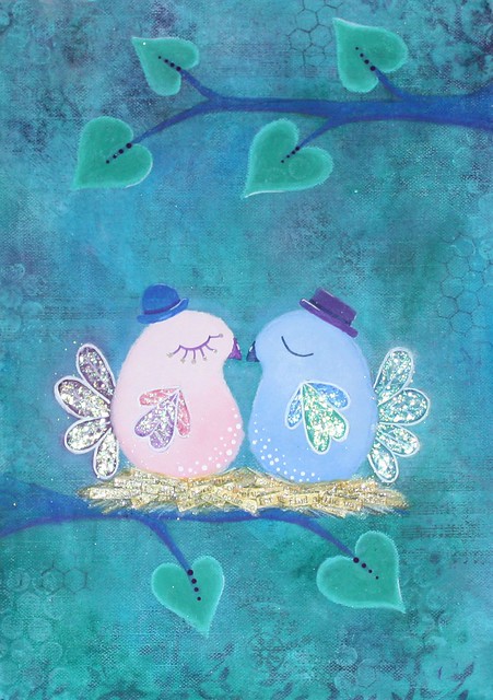
Life Book 2013 - A Series of Quirky Birds
Week 14 of Life Book 2013 is with Tamara Laporte, and she encouraged us to get a little quirky and create some funky little birds. I really loved this project, and it ended up being a portrait of myself and my partner in a little love nest, see how where their beaks touch it forms a heart? The nest itself is made from the printed lyrics from a song by the Dixie Chicks called Easy Silence. See what I did there... birds, nest, chicks!
High School Memories Begin Soon
Wow, New Years Eve already! I spent all of this year focused on my own studies and health. This month I am proud to say that I have completed my Diploma of Counselling and have applied to University to continue forward with a Bachelor of Health Sciences. This gives me a few precious months to relax and get some crafting done!
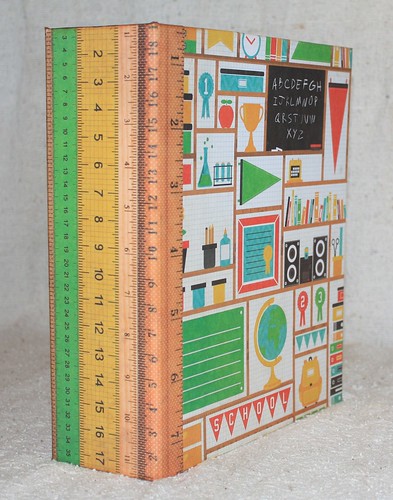
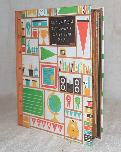
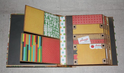
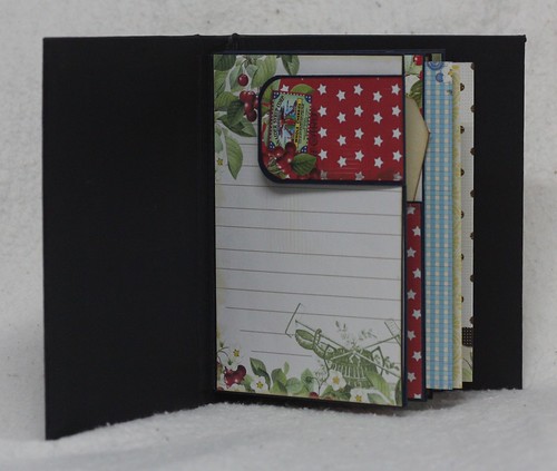
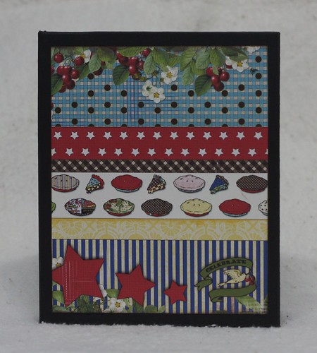
At the end of my school year I completed a project in anticipation of my son starting his first year at high school. The pattern for this project comes from the talented Kathy Orta and is called A Year In Review.
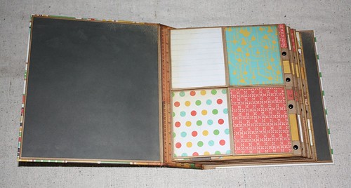
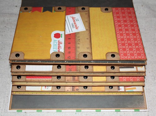
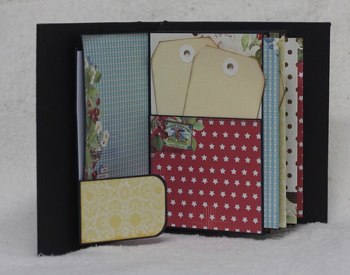
This is a gorgeous pattern, creating a HUGE album that has plenty of pockets and large areas for big photos, school certificates and awards.
Inside are 3 different styles of pages, repeated 4 times, for a total of 12 pages. One for each month.
The thing that I loved most about this album is the massive amounts of storage. It can fit full report cards, drawings, pictures and awards.
The perfect way to document my little monkey's achievements during his first year of high school!
Wednesday, April 17, 2013
Life Book 2013 - Painting Over a Printed Image
Week 9 of Life Book 2013 is with Danita, and she taught us a simple technique for painting over a printed image, such as an image out of a magazine. I chose an image of Drew Barrymore and was quite pleased when hubby immediately recognized her! I love this technique. When you look at the painting you can't tell there is an image undernearth, which makes this a fantastic way to incorporate faces and people into art journals without feeling self conscious about your skill level.
Life Book 2013 - Unstumpification
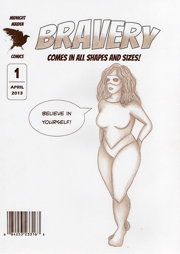
Greetings again! Week 8 of Life Book 2013 is done with the marvelously talented Jane Davenport. This is the most challenging lesson I have done to date, both emotionally and technically. 'Stumpification' occurs when you trace around a photo of person, typically the tracing results in a 'stumpy' version of that person. By using the technique demonstrated we are taught how to 'unstumpify' the tracing. The example Jane did took an ordinary photo and she created a very lithe and sexy fashion model, which is of little surprise as Jane has a background in the fashion industry. The technique of 'unstumpification' is essentially using tracing and illustration to do on paper what magazines do in photoshop to make a woman 'more attractive'.
I choked. With the average woman being a size 12, and with so many women on constant diets, so many women with eating disorders, so many women who hate their bodies and struggle with poor self esteem, I could not bring myself to be a part of that and call it art. I know it's seemingly a small thing but we all have our lines I suppose and this one crossed mine. Further, this lesson was about bravery, and I just couldn't reconcile what seemed to be two completely polar opposite ideals.
I did try the unstumpification technique using photographs of plus size models, but it was still elongating them, smoothing out their curves, essentially making them thinner. In the end I used a plus size croquis, which is a line drawing used in the fashion illustration as a base for drawing clothing onto the human form. The only unstumping I did was to create a slightly longer neckline to allow for the additional of all that hair.
I created the comic book cover in Publisher, printed it out on heavy weight paper and then transferred the croquis using wax transfer paper. I decided to keep it monochrome and used a single shade of brown to keep with a sepia style look. It took two frustrating weeks to create the final version and by the end I was so annoyed with my efforts that I gave up on doing hands and faces, so my comic book heroine is wearing a mask! I am so glad this one is done.
Sunday, March 24, 2013
Life Book 2013 - New Blooms
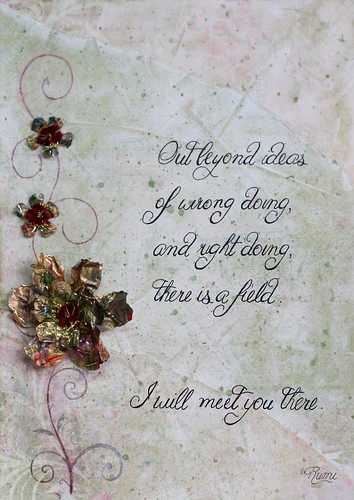
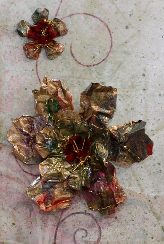
This week's lesson is New Blooms taught by the fabulous Christy Tomlinson. The message of this lesson is to learn from flowers, to take what we have learned in the past (the good and the bad) and to use that to grow anew.
Last year someone told me a secret that was so painful and profane that it left me changed forever. There's a scar on my soul that will never disappear and it's not something I can ever divulge, not even in my art diary.
So how do I express that? The torn paper represents how I felt utterly ripped in two, and the splatters are there for the tears that felt like they would never end. I visualized all that pain and heartache, all that negativity and 'crap' as compost, fertile ground in which to plant a new seed, from which has emerged a new way of looking at the world. One that is less black and white, less judgmental. One that is perfectly captured with the words of Rumi:-
Out beyond ideas
of wrong doing,
and right doing,
there is a field.
of wrong doing,
and right doing,
there is a field.
I will meet you there.
Christie taught us a fabulous technique for making flowers from tin foil. I didn't want the silver of the tin foil showing through, so I covered the foil with gold leaf before applying patterned rice paper and shredded gold cellophane. I then used my Tattered Floral die to cut out the flowers. Because the base is tin foil they are completely mouldable adding outstanding dimension.
The patterned papers in the background are by Kaisercraft and I have used Distress Inks to add texture. This is also my first attempt at hand lettering!
Linking up with:
Simon Says Stamp: Quotable
Make It Monday: Anything Goes
Through The Craft Room Door: Anything Goes
Creative Every Day: Weekly Link
Friday, March 22, 2013
Life Book 2013 - True Intentions
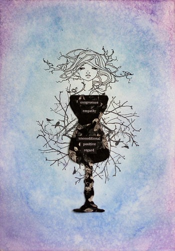
The second lesson in Life Book 2013 is a bonus lesson with Monica Zuniga. Her inspiration to us is to make a paper doll out of (rubber) stamps. She says "Find a figure that represents yourself and then those words that represent what you will be working on throughout the year."
For this page I wanted to express my training and journey as a counsellor. The core principles of person centred counselling are empathy, congruence and unconditional positive regard, and these are the words I have chosen to use in my piece.
I chose a digital stamp by A Day For Daisies called Birds Nest, picking up on imagery of birds as both messengers and a symbol of freedom. As a counsellor I will be in a position to listen to the deepest, most painful, most shameful secrets that burden a soul, and through empathy and unconditional positive regard (non judgment) I can help that soul to find peace and freedom from their pain.
The inner area is done with a rubber stamp by Kaisercraft, from the 13th Hour collection, branches with ravens. Ravens are a sign of alertness and
watchfulness, and Dr. Carl Jung deemed raven symbolism to represent the shadow self, or the dark side of the psyche. The raven is a messenger too, so it symbolises keeping and communicating deep mysteries.
The raven is representing my own inner struggle. One of the core beliefs of counselling is that we cannot take a client to places we have not been. In other words, if I don't explore myself, challenge my own flawed thinking and beliefs (I'm ugly, I'm useless, I'm worthless etc)... If I can't turn the spotlight inward on myself, how can I help others to do the same?
An interesting note that I realized after doing this, is that I have on my back a rather large tattoo that incorporates several ravens. I had the tattoo done years ago so I often forget it's there!
The background is done with Neocolour II watercolour crayons, washed and then spritzed with a water spray and enhanced with Distress Inks. I started in the centre quite light and deepened the colour towards the edges so that I could see that there, in all that inner turmoil, radiates a light, my light.
When I first watched this lesson I was a bit 'meh' about the project, but somewhere along the way it became an incredibly deep and personal expression. Thank you Monica :o)
Thursday, March 21, 2013
Life Book 2013 - Celebration & Journey
This is the first lesson for the Life Book 2013 project. It started in January, and I am only just joining, and with a lesson per week I have some catching up to do. The purpose of this project is to celebrate the journey ahead of us while at the same time doing some mild goal setting.
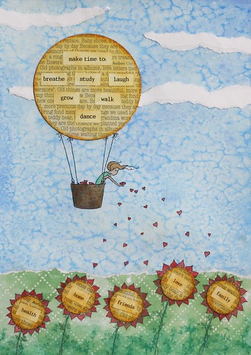
The teacher (Tamara Laporte) suggested that we draw a landscape scene and include one means of transportation to symbolize motion and moving forward. She also included flowers in which she wrote her current blessings and then in the clouds in the sky she wrote the goals and changes she wanted to see happen this year.
I took a slightly different twist on the theme, here's how I did mine.
I started by choosing my mode of transportation, a hot air balloon thanks to this sweet digi from A Day For Daisies. I loved the image of the girl sprinkling love. The next step involves a lot of water so I used a laser printer to get the image onto heavy weight mixed media paper.
I randomly scribbled over the entire piece with Neocolour II watercolour crayons, and then working quickly, liberally washed the entire surface with water. While the wash was still wet I sprinkled with regular kitchen salt, which as it dries draws up the colour creating that gorgeous mottled effect.
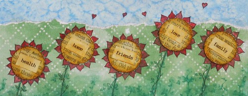
I wanted to tie in the hearts that are being scattered with the flowers, so I created my flowers with heart shaped petals so that it appears she is tending the garden with love. In the centre of the flowers I included my blessings, those things that I am grateful for and tend to daily with love. These are the things that keep me grounded. In the hot air balloon I included my goals, the things I want to work on this year, these are the things I can aspire too.
I loved this project. I have always believed I am quite a crafty person, able to do many handi-crafts, but it wasn't until I started Life Book that I realized that I also have an artist flair and a creative mind that can come up with original and unique interpretations on a theme. To learn more about Life Book 2013 follow this link.
Linking this project up with Simon Says Stamp and Show, whose theme this week is water.
Wednesday, March 13, 2013
Life Book 2013 - Fairy Art Mother
I have just signed up for a year long mixed media/art journalling course called Life Book 2013. The course consists of 22 teachers delivering a lesson each week, and each lesson is downloadable for you to keep so that you always have it to refer to. I am so excited about this course!
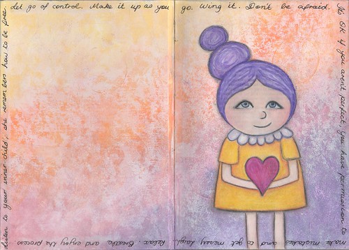
The warmup exercise is to create a "Fairy Art Mother". The idea is that every time your inner critic sends you negative messages, your Fairy Art Mother is there to prop you back up and give you messages of love, praise and acceptance.
My inner critic tells me that I'm somehow less of an artist because I haven't spent hundreds of dollars on brand new supplies, or the supplies I have bought are budget conscious. My critic pushes me to be perfect and is very rigid and controlled.
I did two very similar versions, one in my portable art journal and the other on loose paper to be bound later with all the other Life Book 2013 projects.
The above version is done on mixed media paper. The background is done with Neocolor II watercolour crayons which I layered with Tim Holtz Distress Inks. She is coloured with a mixture of watercolour crayons and Prismacolor pencils.
The second version I did inside the cover of my portable art journal, so she goes with me everywhere. She is coloured with Prismacolor pencils over an acrylic paint background.
She says: "Let go of control. Make it up as you go. Wing it. Don't be afraid. It's OK if you aren't perfect, you have permission to make mistakes and to get messy. Laugh. Relax. Breathe and enjoy the process. Listen to your inner child, she remembers how to be free."
I am linking this up with the following fabulous challenge blogs:
Make it Monday: Always Anything Goes
Through The Craft Room Door: Always Anything Goes
That Craft Place: Anything Goes
Paper Crafting Journey: Anything But a Card
Make it Monday: Always Anything Goes
Through The Craft Room Door: Always Anything Goes
That Craft Place: Anything Goes
Paper Crafting Journey: Anything But a Card
Saturday, March 9, 2013
Masculine Mini Album
My goodness it's so hot here in Adelaide! The longest, hottest summer in record. My craft room is an add-on to the original house with a tin roof, no insulation and no air conditioner. Needless to say its awful in there at the moment!
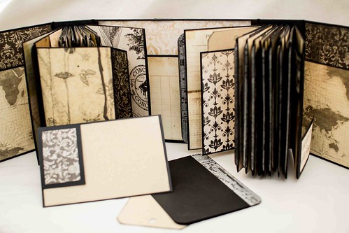
Despite the heat, I have been working on a few albums. This is one I did for my best friend's birthday. He is an excellent photographer and I would love to see him take his photos from the purely digital format that he currently uses to actual printed photographs in a real album.
This album is my version of Kathy Orta's December Daily album. If you are interested you can read my first post on how I reworked her measurements and come up with a slightly different style of album.
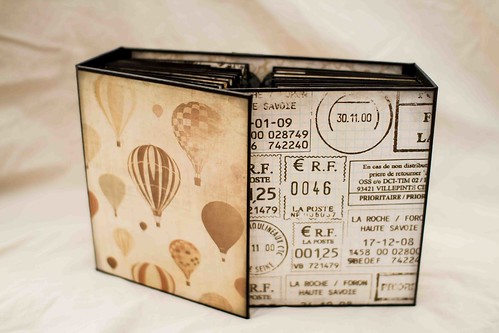
I used black envelopes and cards by Quill to make the album, and the designer papers are all from the Timeless Vintage paper stack by Kaisercraft.
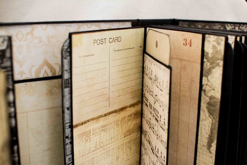
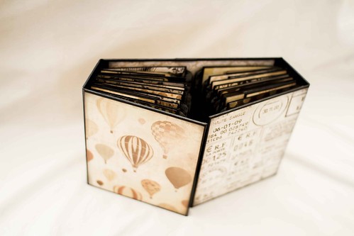
As I mentioned in my other post I reworked the dimensions of the back and front covers to allow for a little extra space in the middle there. Kathy Orta's project has all those envelopes and pages interleaving and overlapping in the middle and I felt there would be too much bulk. You can see from the photos above and below how nicely that extra girth has worked out. The pages and inserts butt up nicely against each other, without creating additional bulk.
Below you can see what the album looks like when opened up. There is a phenomenal amount of storage space, not just for photos but for all the little bits of tickets, tokens and other ephemera that we collect that just doesn't fit in a regular album.
Inside there are also literally dozens of tags and pockets with inserts that can hold extra photos or journalling.
My friend was totally thrilled about the album, he loved the idea of filling it with photos and memorabilia and handing it down to his son with the hopes that it would be a little interactive journey of discovery that he could share.
Sunday, February 10, 2013
Tin Man Treat Box
It's almost Valentines Day, and one of the biggest challenges I find is creating a project that is suitably masculine. There's a lot more creative scope to create romantic themes when you use lace, flowers and other feminine accents.
For this project I chose another of Mo Manning's gorgeous images, this one is called the Tin Man. The image is printed on Kraft card, and coloured with Primsacolor pencils.
The treat box is a popcorn style box that purchased as a set of 10 from a bargain store. The designer paper used to cover it is from Ruby Rock It. I love the black and white contrast and it's speaks suitably of Valentines and love, without being feminine. The edges have been inked with Pumice Stone Distress Ink and the project is finished simply with a ribbon and a metal heart charm.
I really enjoyed this project. This would look great filled with those chocolate hearts covered in red foil... my man doesn't like chocolate so I will probably fill it with cookies.
Entering this into the following challenges:Mo Manning's DP2 Challenge: Anything Goes
Make it Monday: Anything Goes
Friday, January 11, 2013
Kathy Orta December Daily Reworked - C6 size
I just love, love, love Kathy Orta's patterns (if you are familiar with her videos you will know she uses the phrase 'love, love, love' quite a bit), so when she published her free December Daily mini album I couldn't resist making one of my own.
December Daily Part Three
December Daily Album Cover
If you want to watch the preview of her album you can view it on You Tube here.
The envelope and card kits she uses come from Michael's. The cards measure 5" x 6 1/2", with the matching envelope measuring 7 1/4" x 5 1/4". These are not available in Australia, and the closest we can get is the C6 card size which measures 105mm x 150mm (pretty close to 4 1/8" x 5 7/8") with the matching envelope measuring 4 1/2" x 6 5/16". As you can see that is a sizable difference, which if course is going to mean an adjustment throughout to many of the measurements.
So this post follows Kathy Orta's instructions but converting them down to a C6 size for those of us who can only get access to that. I am sure you are all capable of doing this without someone telling you how, this is mostly so when I make another one (and I plan to make several), I have all the measurements recorded.
This mini will be smaller than the original so on most pages and page inserts it won't take a standard 4" x 6" photo, but it will take the 3.5" x 5" print which is the next size down. Of course you can always custom size and crop your own photos according to your own needs, but the 3.5" x 5" (or 9 x 13cm) print size option should be readily available worldwide in any photo store. You can, however, put a simple mat on as many of the pages as you want, which will (just) take a 4" x 6" photo.
You can watch Kathy Orta's original video on how to make part one of the December Daily here. Watching her video is essential for understanding how the album is constructed, I am merely giving my measurements for using a smaller C6 size envelope and card.
Card Page One
The measurements for this page remained the same as the original. Go ahead and make the cuts at 2"and trim down to 3". Trim the corners as desired. Adhere together as shown and then trim off 1/2" off the side that doesn't have flaps. Your card should measure 3 5/8" across. This gives room for the hidden hinge binding and still allows your card to fit in nice and flush.
Card Page Two
Trim the card at 1/2" to the right hand side of the scored edge. Keep the piece you trimmed off and put it aside to make a pocket later.
Envelope Page One
Go ahead and seal the envelope as instructed. Trim a sliver off one end, and then trim the other end so that the envelope measures 4 1/8" across (the same width as the card).
Envelope Page Two
Adhere the flap of your second envelope to the first envelope page as instructed. Trim the second envelope so that it too measures 4 1/8" across.
Pocket One
Take the extra piece you trimmed away while making the second card page and trim it so it measures 5 1/8" along the long edge. When directed, score each edge at 1/2" and adhere as shown to create the pocket. This creates a pocket 4 1/8" wide (same width as the card) and 3 5/8" high
Twin Pocket (Variation)
I felt that given the reduced overall size of the album that the twin pockets were a bit too small to have any practical function, so I adjusted it to make one large side loading pocket. I wanted a pocket that measured 6 1/4" x 2 1/4", so I cut a piece of cardstock at 7 1/4" x 2 3/4" and scored at 1/2" on three sides.
You can watch Kathy Orta's original video for part two of the December Daily here. Watching her video is essential for understanding how the album is constructed, I am merely giving my measurements for using a smaller C6 size envelope and card.
The Envelope Pages
Adhere the two envelopes together as shown. Place envelopes into your paper trimmer and line up so the edge of the envelope is just a smidge over the 5" marker (this is where Kathy lines hers up to the 5 3/4" mark). This should place the fold line for the envelope flap directly on the half inch marker, giving you a half inch flap when you trim.
In the original version the envelopes are then folded in on each other, and the top facing envelope is trimmed down to 4" in width. This is a reduction of 1 1/4". We are actually going to trim off an extra 1/8" so that when our pages are all folded there is an even 1/2" spacing between the three pages. So we are going to trim off 1 3/8". You don't have to, you can keep the original measurement, but I am a kook for symmetry.
Slide the envelope into the trimmer so the bottom facing envelope is being cut and trim so that it is 4 1/8" wide.
The Middle Card Pocket
The original directions tell you to trim off 1/2" off one side, do this by lining up your card fold at the 3 5/8" mark. Score and assemble as directed. To attach this page to the envelope pages measure 5 3/8" up from the bottom (instead of the 6" in the original instructions).
The First Pocket
On the inside of the first page is a pocket, the original measures 5" x 5". Ours will measure a scant 4 1/16" x 3 1/2". Score on three sides at 1/2" and assemble.
Back Page Pocket
Cut one card in half as directed. Trim the long side of this piece to generous 5 1/6". Score at 1/2" on three sides and form a pocket.
Belly Band
For the belly band on the back of the middle page, take the bottom flap that you cut off to make the middle card pocket and score it at 1/4" at each end.
December Daily Part Three
You can watch Kathy Orta's original video for part three of the December Daily here. Watching her video is essential for understanding how the album is constructed, I am merely giving my measurements for using a smaller C6 size envelope and card.
First Envelope Page
Adhere the two flaps together as shown. Trim envelopes down to 4 1/8". Trim the excess off the flaps so it measures 1/2".
Envelope Half Pages
Seal the envelope as directed. Fold in half and trim along fold line. Trim a sliver off the closed end of each envelope half, which should make your envelope halves now 3 1/8" wide.
Assembling the two parts
Make a snip in the excess flap as shown at the halfway mark, which will be approx 3 3/16" (this measurement doesn't need to be precise). Attach the two half pages as shown.
Front Page Pocket/Sleeve (to insert the hidden hinge)
Cut a piece of pattern paper 3" x 7 1/4". Score half each at each short end and attach as shown.
Pocket on Inner Page
Cut a piece of cardstock 5 1/2" x 5 1/6". Score at 1/2" on 3 sides and fold to form pocket. Attach as shown. As this album is smaller than the original, and it already has so many pockets, I chose to omit the pocket here and simply mat with a piece of card cut at 6 1/4" x 4". This will allow me to put in a slightly trimmed 6" x 4" photo.
December Daily Hidden Hinge Binding Strip
You can watch Kathy Orta's original video on how to make the hidden hinge part of the December Daily here. Watching her video is essential for understanding how the album is constructed, I am merely giving my measurements for using a smaller C6 size envelope and card.
The only measurement here that is different is the height of the binding strip, which will be 6 1/4".
December Daily Album Cover
You can watch Kathy Orta's original video on how to make the album cover of the December Daily here. Watching her video is essential for understanding how the album is constructed, I am merely giving my measurements for using a smaller C6 size envelope and card.
There are three parts to the album cover... the back panel, the front panels and the side spines.
The original back panel is cut at 7 3/4" x 7 3/4" which works out to be 1/2" taller than the envelope used in the original. We can keep the same proportions. Our envelopes measure 4 1/2" x 6 5/16". Because this is the cover and 1/6" of an inch extra to the height of this album won't make any difference we are going to round these proportions up to 4 1/2" x 6 3/8". So we will cut our back panel piece to measure 6 7/8" x 6 7/8".
The original album front panel cover pieces are cut at 7 3/4" x 6" which works out to be 1/2" taller than the envelope and 3/4" wider than the original envelope. Once again we can keep these same proportions and cut two panels that measure 5" x 6 7/8".
The original side spine panel pieces measure 7 3/4" x 2". Ours will measure 6 7/8" x 2".
December Daily Album Cover - My Version
The original album cover is done in such a way that the pages interleave. I think this creates excess bulk in the centre of the album, we have six pages evenly spaced at either end, but in the centre those six pages overlap creating the bulk of 12 pages. Depending on how you load your pages this can create too much bulk in the centre, so I widened the cover to allow the pages to sit next to each other, rather than on top of each other.
There are three parts to the album cover... the back panel, the front panels and the side spines.
The original back panel is cut at 7 3/4" x 7 3/4" which works out to be 1/2" taller than the envelope used in the original. By increasing the width an extra inch to 8 3/4" this allows our finished pages (which measure 4 1/4" each, to sit side by side without overlap. So for my version I cut the back panel piece to measure 6 7/8" x 8 3/4" (this is an inch wider than the original width).
To compensate for the extra inch width to the back cover, we will add an extra half inch to each front flap, cutting two pieces at 6 7/8 x 5 1/2".
The original side spine panel pieces measure 7 3/4" x 2". Ours will measure 6 7/8" x 2".
Tuesday, January 8, 2013
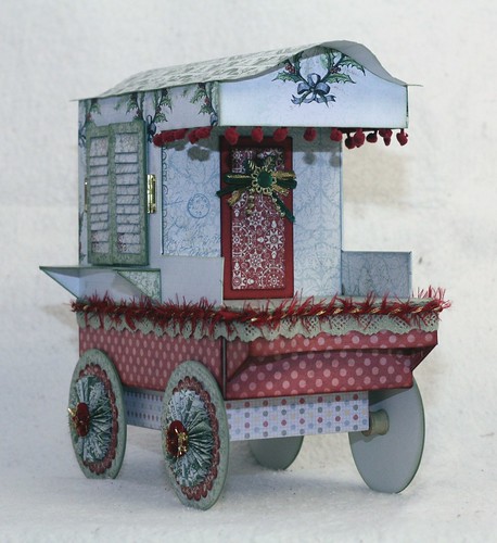
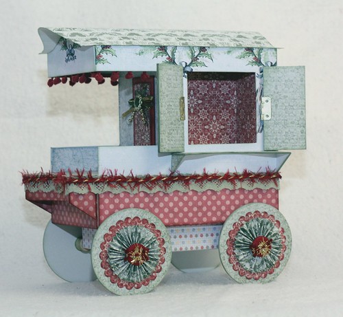
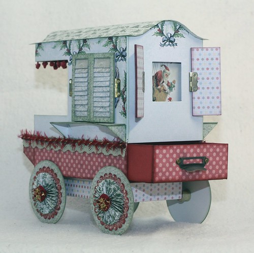
Gypsy Caravan, Christmas Style
I am totally in love with this project. The concept is just fabulous, and open to so many different style interpretations. The pattern is called Gypsy Caravan by Laura Denison of Following The Paper Trail.
This is just my practice project, one I 'whipped' up to make sure the instructions and pattern was accurate, before using my good paper. I am glad I did too, because the instructions are at times a little mysterious, which is helped somewhat by watching the Ustream videos, but even then I threw out the first attempt because one of the measurements were incorrect and you weren't advised until the second video that this was the case, at which point it was easier to just ditch the one I had made and start again. There are also instructions not included in the downloadable pattern that she goes through on the video, so be prepared. If you want to make this project I strongly urge you to sit through all the videos before you start construction.
I buy my chipboard in 30" x 17" sheets, and this used almost a full sheet to put together. The paper range I used is by Jodie Lee called Father Christmas Papers which you can still find in scrapbook stores printed under the Pink Paislee label, or you can download it digitally from Jessica Sprague. That is exactly what I did, and then printed it out on matte photo paper using my inkjet.
The pattern comes with instructions to make a mini album to fit in the trunk of the caravan, but I wanted something simpler and quicker to make, and also something that would suit anyone, not just photo enthusiasts. So I whipped up a little drawer that fits in that space which could hold all manner of doo-dads. Notice it's a wee bit wonky? That's why I do a test run, it lets me see what fits and what doesn't, so when I do a 'proper' one I am aware of any issues before hand.
The fabric trims and buttons I bought in 2011 in a clearance sale at Spotlight(Australia's poor cousin to Joann's or Michael's). I liked them so much I held onto them and held on to them waiting for that special project... sound familiar? Aside from the fabric trims I haven't added any embellishments. As this was a practice project I think I will probably donate it to my son's school for a raffle, or donate it to the local hospital or something like that, and let the recipient fill it with goodies and add any extras.
Linking up with the following blogs:
Make it Monday: Always Anything Goes
Use it Tuesday: Make It Sparkle (gold tinsel on buttons and trim)
Inky Chicks: Anything Goes
Shopping Our Stash: Use Your Old Buttons (buttons as hub caps on wheels)
Through the Craft Room Door: Anything Goes
Simon Says Stamp & Show: Embrace the Old (used up hoarded trims and buttons)
Sunday, January 6, 2013
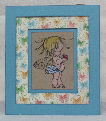
Well Hello Little One
My best friend has had his first child, a son, little JJ. He was born a healthy 8lb on the 5th January 2013. I had already made a substantial gift for him (which you can see here), but I wanted a small token to take with me when I went to visit for the first time in hospital.
I used a left over sheet from the same paper collection for this hanging frame that I used for the baby blocks, so it will co-ordinate nicely in his room. His Mum is a lover of lady bugs, so the cute little darling from Mo Manning was perfect.
He is coloured with Prismacolor pencils on Kraft, and matted with Duck Egg Blue card by Kaisercraft and some left over from the Little Darlings by G45, with a liberal dash of Stormy Sky Distress Ink, which thankfully hides all manner of flaws!
Linking this up with Mo's Challenge Blog, the flavour this week is Anything Goes.
Also linking up with the fab crew at Make it Monday, where it's always Anything Goes.
Also linking up with the fab crew at Make it Monday, where it's always Anything Goes.
Subscribe to:
Comments (Atom)
