Showing posts with label card making. Show all posts
Sunday, January 12, 2014
A Little Bird Told Me
By Zeus' Beard it's hot! With temperatures forecast at over 44C (111F) everything here is a parched, with tones of pale cream to golden yellow. That was my inspiration for this card.
The image comes from A Day For Daisies and is called A Braid In My Hair. It's printed onto Canson Watercolour Paper and coloured using Distress Markers and a Tombow Blender. I am having so much fun with these at the moment, my new favourite toy! The paper is by Graphic 45 and the flowers are by Kaisercraft.
Linking this up with:
A Day For Daisies: Add Yellow
Make It Monday: Always Anything Goes
Tuesday, January 7, 2014
Cupcake Thief Birthday Card
With a month or two until University starts I'm taking advantage of the quiet time to restock my stash with some go to cards. This little cutie is called Cupcake Thief and she comes from Mo Manning. She is printed onto watercolour paper and coloured using Distress Markers and Yasutomo iridescent watercolour paints.
Thanks for stopping by and I hope you have a fabulous day. Remember, if you do eat cupcakes today, to burn off those calories afterwards, run like you stole them!
Linking up with:
Mo Manning: Anything Goes
Make it Monday: Always Anything Goes
Monday, February 13, 2012
A Fairy Happy Easter
Card Positioning Systems is celebrating their 5th Anniversary by releasing a sketch a day for 15 days.
This card is my interpretation of the day fourteen sketch, my goodness only one more to go!
The fairy postcards are Graphic 45, part of their Once Upon A Springtime Collection. The designer paper is Kaisercraft, part of their Sweet Nothings collection. I've inked all the edges with Antique Linen and Bundled Sage Distress Inks.
The leaf accent is cut from a Spellbinders die, the butterflies are a Martha Stewart punch, the roses are from Kaisercraft and last but not least the bow is a fabulous crochet yarn from my stash.
Sunday, February 12, 2012
Mr Mischief
Card Positioning Systems is celebrating their 5th Anniversary by releasing a sketch a day for 15 days.
This card is my interpretation of the day thirteen sketch.
I made this card with my son in mind, who will be 12 years old this year. Very clean and simple. The rocket image and Mr Mischief comes from a Ruby Rock-it paper called Tokens, part of their Paper Boy collection. The graph paper is the reverse side of Dressform, one of Kaisercrafts Timeless Collection. I've used an EK Success punch to give the notepad edge, a bit of black and white bakers twine and a star shaped paperclip to finish.
Saturday, February 11, 2012
Let's Catch Up
Card Positioning Systems is celebrating their 5th Anniversary by releasing a sketch a day for 15 days.
This card is my interpretation of the day twelve sketch.
My first thoughts were of florals and bows and doilies, but I decided I wanted to do something drastically different with this sketch, and I hope I have achieved that... instead of a bow I have a propeller!
The designer paper is by Bo Bunny, the cogs are cut using Spellbinders gears die and the image is a clipart from my collection. The sentiment inside reads "Let's Catch Up".
Friday, February 10, 2012
Pretty In Pink Card
Card Positioning Systems is celebrating their 5th Anniversary by releasing a sketch a day for 15 days.
This card is my interpretation of the day eleven sketch.
Finally, a sketch that came together painlessly! I knew the instant I saw this sketch what elements I was going to use, and the longest part of the whole card was making the skirt.
The background paper is from the Sweet Nothings collection by Kaisercraft. The dress form is cut using the Sewing Room die by Tim Holtz from a scrap of cream toned paper on chipboard. The tickets are by Tim Holtz also, and the crochet skirt is by me.
Thursday, February 9, 2012
Noel Card
Card Positioning Systems is celebrating their 5th Anniversary by releasing a sketch a day for 15 days.
This card is my interpretation of the day ten sketch.
I have used Webster's Pages paper as the background paper, December Journal. I purchased it as a digital download, so I was able to resize it as I saw fit, so I made it fit a 6" x 6" card. I love the versatility of digital papers.
The "postcard" stamp along the edge there is by Tim Holtz, inked with Vintage Photo Distress Ink, and the vintage Santa is a Bo Bunny acrylic stamp inked with StazOn Black on vellum. A liberal shading with Vintage Photo has been done around most of the edges.
The wooden word NOEL I picked up during the post Christmas sales this year. I painted it with Burnt Umber acrylic paint and sanded it back to distress it, then lightly inked the edges with Versa-color gold ink.
Tuesday, February 7, 2012
Vintage Sewing Card
Card Positioning Systems is celebrating their 5th Anniversary by releasing a sketch a day for 15 days.
This card is my interpretation of the day eight sketch.
The card base is Kraft once again, the patterned paper with the sewing patterns is called Dressform from the Timeless Collection by Kaisercraft, and the centre panel is from the Domestic Goddess series by Graphic 45. A paper doily provides the lacey ruffle and the accent is a paper rose made from coffee filter paper and the Rose Creations die by Spellbinders.
Monday, February 6, 2012
Christmas Baking with Tilda
Card Positioning Systems is celebrating their 5th Anniversary by releasing a sketch a day for 15 days.
I've used Kraft card as the base for this card (yes again!) but this time it's a darker Kraft, much darker than the Bazzil version. The patterned papers are by Kaisercraft, part of the December 25th collection and have a lovely, muted tone to them that works very well with the Kraft.
I struggled a little colouring Tilda on the darker Kraft, the Prismacolor pencils weren't really doing what I wanted them to do and in sheer frustration I dampened a cloth with baby oil and wiped over the whole thing, with the intent of taking it back to the base, and voila! I had exactly the look I wanted :o)
The recipe card is removable, with the striped bar across the bottom acting as a sleeve for the card. If you are interested in my recipe I posted it back in December last year, you can find it here.
The sentiment is a free download from the Shabby Princess, it came as part of a holiday recipe kit.
This card is probably my favourite of all the ones I have made for the CPS Challenges so far. The Tilda with spoon stamp is an all time favourite of mine, and the colours and vintage feel all worked really well.
Sunday, February 5, 2012
Retro Sewing Card
Card Positioning Systems is celebrating their 5th Anniversary by releasing a sketch a day for 15 days.
This card is my interpretation of the day six sketch.
This card was made with a Vintedge kit by Ruby Rock-It, on a Kraft base. The kit was fantastic value, 6 different paper designs (2 of each for 12 sheets total), plus stickers and die cuts for $10. I used the Tim Holtz Sewing Room Alterations die to cut two bobbins and wound embroidery floss around the centre and attached them as accents. There is also a yellow bobbin inside next to the sentiment which reads: "May your bobbin always be full".
I'm still not sure if I like this card, retro is not something I have played around with much. I am sure if I pop in a fat quarter of quilting fabric the recipient won't care what the card looked like ;o)
Saturday, February 4, 2012
Christmas Is Strange
Card Positioning Systems is celebrating their 5th Anniversary by releasing a sketch a day for 15 days.
This card is my interpretation of the day five sketch.
The fabulous word art is a freebie that you can download here from Studio Bethany. In case it isn't clear on the card it reads:
So true and so funny! The cute little bear is by Bugaboo Stamps, called Christmas Teddy Stocking. I've coloured him with Copics and used Polar White Flower Soft for the trim.
When you open the card there is a surprise inside, there's a compartment that houses a full size block of chocolate... fruit and nut chocolate of course! :o)
I am also entering this card into the ABC Christmas Challenge. Then theme this fortnight was B for Bear... Bears with one or more from Bunting, Banners, Brads,Bling, Buttons, Bows & Blooms Challenge.
Friday, February 3, 2012
Puppy Love
Card Positioning Systems is celebrating their 5th Anniversary by releasing a sketch a day for 15 days. I've still got plenty of catch-up to do if I am going to finish all 15!
This card is my interpretation of the day four sketch.
This card uses my third of four coloured digis by Mo Manning called Pug Love. Once again coloured with Prismacolor pencils, this one blended with odorless solvent. If you look at this card, and the one in the last post, you can see the difference quite clearly between the two blending mediums.
The background paper is called Love, part of the Vintedge collection by Ruby Rock-It. The black mat behind the digi has been embossed with hearts, and then sanded to distress and highlight the hearts. The sentiment is part of a KaiserCraft clear stamp kit called Love.
I am also entering this into Mo's Digital Challenge blog, which has an anything goes theme this week, as well as the Simon Says Stamp Challenge, the theme of which is Animal Antics.
One Of A Kind
Card Positioning Systems is celebrating their 5th Anniversary by releasing a sketch a day for 15 days. I'm playing catch up but it has been great to get the coloured stamps out of plastic baggies and onto cards :o)
This card is my interpretation of the day three sketch.
The adorable little pup is a Mo Manning digital stamp called Pug Love. You'll see this pretty puppy appear in several cards, not just because it's so cute, but because I coloured four of them at the same time! Once again this has been coloured with Prismacolor Pencils, I love, love, love working with them at the moment. I used baby oil as the blending medium.
Also entering into the Simon Says Stamp Challenge this week, the theme of which is Animal Antics.
Thursday, February 2, 2012
Hang In There
Card Positioning Systems is celebrating their 5th Anniversary by releasing a sketch a day for 15 days.
This card is my interpretation of the day two sketch.
The base is Kraft, it's my current favourite. The designer paper is called Dragonflies from the Pink Paisley Butterfly Garden collection. I've inked the edge of the doily with Antique Linen Distress Ink and finished with a natural raffia bow.
The stamp features Toby Tumble by Pachela Studios called "Just Saying Hi". He's the cutest little bunny there ever was! I've coloured him with Prismacolor pencils, and used a paper stump with baby oil as the medium for the blending. The sentiment inside reads "Hang In There".
Also entering into the Simon Says Stamp Challenge this week, the theme of which is Animal Antics.
Love Defined
Card Positioning Systems is celebrating their 5th Anniversary by releasing a sketch a day for 15 days. I've got a list of cards I would like to have made and ready to post for when the occasion arises, such as a sympathy card, a get well card, a few generic greeting cards, as well as getting a head start on some holiday cards, and this is just the motivation I need to get going.
This card is my interpretation of the day one sketch. The card was challenging for me because I think it is the very first I have made without a coloured image on the front, so it felt a little naked and I wasn't really sure when to stop fiddling!
The designer papers are by Kaisercraft, one is called Script and the other is called Newsprint, both are from the Timeless collection. I've used a Fiskars edge punch for the heart borders, Kraft card for the base and framing mats, and Frayed Burlap Distress Ink on all the edges.
The little postage stamp in the top corner says "Love has nothing to do with what you are expecting to get, it's what you are expected to give - which is everything".
Monday, September 5, 2011
Hooray for Birthdays
Technique: Papercraft
Images:
Gus Birthday digi from Bugaboo Stamps
Markers, Inks & Pens:
Flesh: E0000, E000, E02
Denim Blue: B91, B93, B95
Moss Green: YG61, YG62, YG67
Orange: YR02, YR04
Redwood: E15, E17, E19
Faded Denim distress ink
Designer papers:
Little Toot Collection - Cruise by Kaisercraft
Seaside Collection - Coast Line by Kaisercraft
Embellishments:
Glossy Accents on glasses
yellow glitter glue on headlights
metallic silver pen on handle bars
Another birthday in the house this week, this time for a 29 year old male. He's a funny guy, a little cantankerous at times, we often joke that he is an old man trapped in a young man's body, so dear Gus seemed the perfect choice!
The sentiment on the front comes with the digi, and inside it reads "Hooray for Birthdays".
I think the only birthday card left to make is for my Mother at the end of this month, then nothing until January, which gives me a good long stretch to work on Christmas cards and gifts.
Saturday, September 3, 2011
Father's Day Card
Technique: Papercraft
Materials:
designer paper
DIY Chester digi from Pollycraft
Copic markers
It's Father's Day this Sunday, so a card from my son to his Dad was in order. We have always joked with our son, who from a wee age has been quite the climber, so we nicknamed him "monkeyboy". This darling little image of Chester was perfect. The sentiment inside reads "For the one hundredth time, I am NOT a monkeyboy". His face was filled with joy as he gave it to his Dad, and isn't that exactly why we do what we do? :o)
Wednesday, August 17, 2011
Poorly Chester Get Well Card
Images:
Poorly Chester from Pollycraft
Papers:
Kaisercraft "Prairie Lane"
AC Cardstock Lagoon: Weave
Pens and Inks:
Copic Markers
silver gel pen
white gel pen
red gel pen
As I was doing my morning coffee, catching up on the blogs I like to check in on, I found this post on Paper Canteen Creations. In summary:
My brother's dear friend and former roommate, Ryan, was involved in an accident on a Saturday afternoon in April 2011 in New Orleans, while riding his bike to meet up with friends. The facts of the accident remain unclear but Ryan did sustain a brain injury. As a side note - Ryan moved from CA to NOLA after Katrina to live there and help/work with the relief efforts to help the citizens of NOLA rebuild. Ya...he's an amazing young man.
So - what am I asking of you? I'm asking you to think of him, send blessings, prayers, white light, love and healing (however you manifest those thoughts and feelings) in the form of cards to send his way.
I am such a softie for good causes, and already regularly contribute to Angels for Hope, I just couldn't resist whipping up a get well card to send off. There is also a very, very generous thank you pack being sent out by the organizers to all who participate and send in a card. Visit the link for full details, the mailing address for the card and instructions.
The adorable Chester available at Pollycraft is cute, but not girly cute, so great to put on a card for a male. The brown and blue tones coupled with the clean and simple design are also suited to a masculine card. The tip of the thermometer is coloured with a silver gel pen for a metallic feel, likewise the 'mercury' in the thermometer has been touched with red metallic pen. Although you can't really tell in the photo, the thermometer has a coat of Glossy Accents to make it look like glass. As a finishing touch I reinforced the white dots on Chester's eyes with a white gel pen.
This sweet little card is on it's way to Ryan, along with all the white light and fluffy bunny energy I could muster! :o)
Wednesday, August 10, 2011
Purrfectly Delightful Card
Technique: Papercraft
Materials:
cat with flower digi from Motivet
co-ordinating bazzil
Basic Grey DP
Copics
Fur: E31, E33, E35, E37
Green: YG61, Y63, YG67
Orange: YR02, YR04, YR07, C1
Distress Ink: Bundled Sage
button
warm and natural batting
adhesive
Tools:
Sizzix Big Shot
Tim Holtz Alerations: Tattered Florals die
Spellbinders leaves die
Spellbinders scalloped circles die
My husband's birthday is next week, and with a little help from the youngest, this is the card we made for him. Our little one picked the image, he has such a fondness for cats. Usually I would do a fairly smooth rendering of the fur when colouring, but I wanted to join in on the i-Copic challenge this week to colour fur, so I deliberately tried for a textured look. I was quite pleased with the result and would probably do it again to simulate long fur.
The designer paper is from the Mellow range by Basic Grey, and I chose this before colouring the flower the cat is holding, so that the image would co-ordinate with whatever paper I chose. I wanted a card and a colour scheme that whilst cute was still decidedly masculine, as it was being given from son to father.
The flower is cut from warm and natural quilt batting, which I left completely untouched as it has a lovely, rustic fleck through it already, and has a vintage leather button in the centre. The leaves are using a Spellbinder die which is inked with Bundled Sage distress ink along the edges. The scalloped circle is also a Spellbinder nestie.
The sentiment inside reads : "Have a PURR-fectly delightful day".
This card was smaller than I usually make, only 5", whereas most of the other cards I had made 6" square. The DP was perfect for the image, but pretty busy, I felt it favoured a smaller card. What is your favourite card size? I am still experimenting to see which I like best, I think the larger cards favour larger and more flamboyant embellishments.
Challenges:
i-Copic: Fur
Here Come the Boys: Critters
Challenges:
i-Copic: Fur
Here Come the Boys: Critters
Saturday, August 6, 2011
Steampunk Birthday Card
Technique: Papercraft
Materials:
Scarlett West digi
Copics Markers
Skin: E0000, E00, E02
Golden Brown: Y23, Y26, Y28
Leather Brown: E31, E33, E35, E37, E29
Black: C0, C3, C5, C7
Steampunk Debutante paper by Graphic 45
Distress Inks;
* Vintage Photo
* Antique Linen
* Black Soot
* Walnut Stain
Vintage Photo Stickles
Copper Gel Pen
cardstock
craft metal
metallic copper embossing powder
Tools:
Sizzix Big Shot
Cuttlebug embossing folder, Clockworks
Spellbinders Spritely Sprockets
Steampunk rubber stamp set by the Rubber Cafe
I've been in love with steampunk long before it was cool. Way back in 2001 a PC game called Arcanum: Of Steamworks and Magick Obscura was released and since then I have been in love with all things steampunkery. So this recent steampunk trend has been a dream come true for me, a way to embrace and explore a theme that previously wasn't available to mainstream crafting.
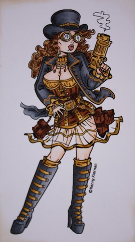
There have been a lot of steampunk digital stamps released lately, but many of them have been too 'cutesy' for my taste. The recent releases by Kenny K are right up my alley though! Edgy, sexy but still a little gritty.
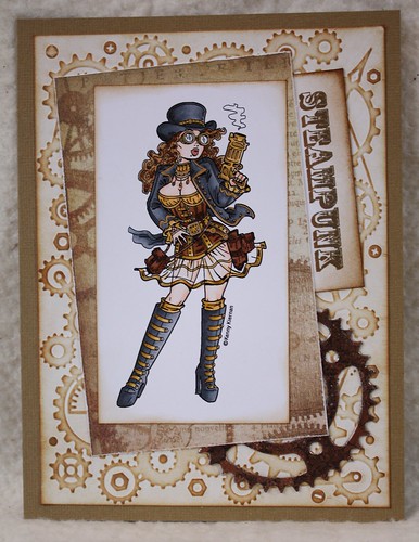
I made this card for a friend of my husband, who has been adopted by us all as a family member, it was his birthday today! He has been admiring my colouring lately, and Kenny K's images are perfect for male cards. The sentiment inside reads:
"You can't turn back the clock, but you can wind it up again..."
Now that I have bored you all with my personal rantings, the card was a pretty easy one to construct. The background paper is a piece of white card put through the sizzix in the clockworks embossing folder, then highlighted with antique linen and vintage photo distress inks.
The gear in the lower corner is a cut using the spritely sprocket die set. I used a piece of craft metal, which is embossed with copper embossing powder, which is then inked with black ink to grunge it up and age it, with a sprinkle of vintage photo Stickles.
![]() |
This photo has been taken with the flash on so that the light reflects, not so good for the paper but it shows the shimmer from the copper gel pen on her outfit and gear. |
The "steampunk" tag sticking out the side of the main image is from the Steampunk set by the Rubber Cafe, inked with vintage photo and walnut stain. The paper behind the main image is from the Steampunk Debutante range by Graphic 45.
Challenges
iCopic Challenge: skin tones (Kenny K's girls show so much flesh!)
Kenny K's Crafty Girls: metal embellishment
Subscribe to:
Posts (Atom)