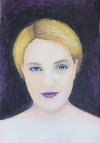
Week 9 of Life Book 2013 is with Danita, and she taught us a simple technique for painting over a printed image, such as an image out of a magazine. I chose an image of Drew Barrymore and was quite pleased when hubby immediately recognized her! I love this technique. When you look at the painting you can't tell there is an image undernearth, which makes this a fantastic way to incorporate faces and people into art journals without feeling self conscious about your skill level.
Wednesday, April 17, 2013
Life Book 2013 - Unstumpification
Greetings again! Week 8 of Life Book 2013 is done with the marvelously talented Jane Davenport. This is the most challenging lesson I have done to date, both emotionally and technically. 'Stumpification' occurs when you trace around a photo of person, typically the tracing results in a 'stumpy' version of that person. By using the technique demonstrated we are taught how to 'unstumpify' the tracing. The example Jane did took an ordinary photo and she created a very lithe and sexy fashion model, which is of little surprise as Jane has a background in the fashion industry. The technique of 'unstumpification' is essentially using tracing and illustration to do on paper what magazines do in photoshop to make a woman 'more attractive'.
I choked. With the average woman being a size 12, and with so many women on constant diets, so many women with eating disorders, so many women who hate their bodies and struggle with poor self esteem, I could not bring myself to be a part of that and call it art. I know it's seemingly a small thing but we all have our lines I suppose and this one crossed mine. Further, this lesson was about bravery, and I just couldn't reconcile what seemed to be two completely polar opposite ideals.
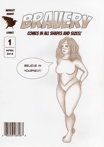
I did try the unstumpification technique using photographs of plus size models, but it was still elongating them, smoothing out their curves, essentially making them thinner. In the end I used a plus size croquis, which is a line drawing used in the fashion illustration as a base for drawing clothing onto the human form. The only unstumping I did was to create a slightly longer neckline to allow for the additional of all that hair.
I created the comic book cover in Publisher, printed it out on heavy weight paper and then transferred the croquis using wax transfer paper. I decided to keep it monochrome and used a single shade of brown to keep with a sepia style look. It took two frustrating weeks to create the final version and by the end I was so annoyed with my efforts that I gave up on doing hands and faces, so my comic book heroine is wearing a mask! I am so glad this one is done.
Subscribe to:
Comments (Atom)

